

Arqis Health
– Logo
– Brand guidelines
- PPT template
Overview:
Working alongside Paul Waddington at DDME, I was brought in to lead the creation of a new logo for Arqis Health, shaping its visual direction and design language. I extended the logo across brand guidelines and presentation templates to ensure clarity and consistency, while Paul translated the new logo and colour scheme seamlessly into the website design and build.
Working closely with the team at Arqis Health, the project began with a comprehensive brief outlining the group background and how it brings together the complementary strengths of Dr Foster, Four Eyes Insight and Prism Improvement, along with a current value proposition.
I developed and presented two distinct creative concepts, each exploring a different visual direction, before refining the selected route into the final mark.
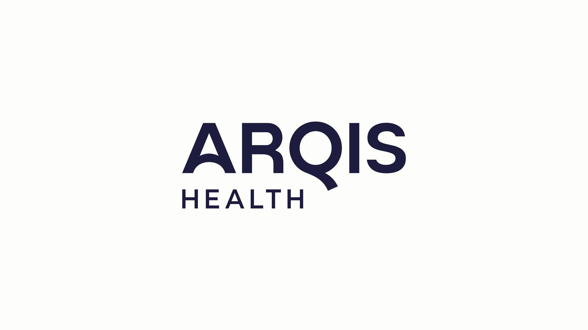
The Arqis Health logo presents a bold, modern, and authoritative identity through its strong geometric sans-serif wordmark and distinctive custom details, particularly the extended tail of the “Q” and the subtle arch within the “A”.
The letters A and Q are given greater stylistic emphasis to represent “Answers & Questions”—reflecting our core purpose. We provide the answers and ask the right questions to help NHS leaders understand what is happening, address root causes, and deliver measurable, sustainable improvement.
The deep navy colour reinforces trust, stability, and professional credibility—key attributes in the health sector—while the clean, minimalist design communicates clarity and strategic confidence. Its balanced proportions and heavy weight give it presence across digital and print applications, positioning the brand as intelligent, dependable, and forward-thinking.
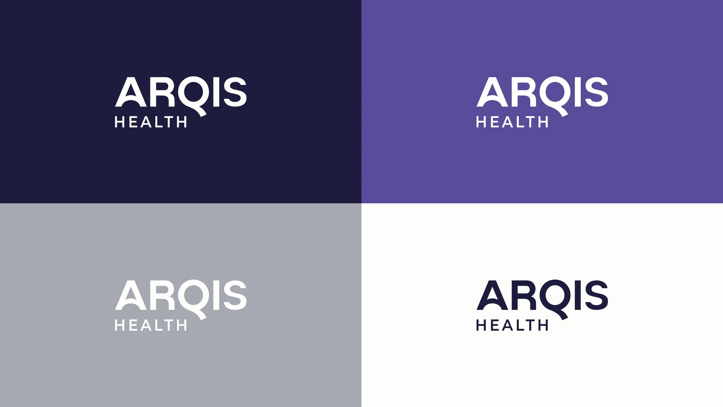
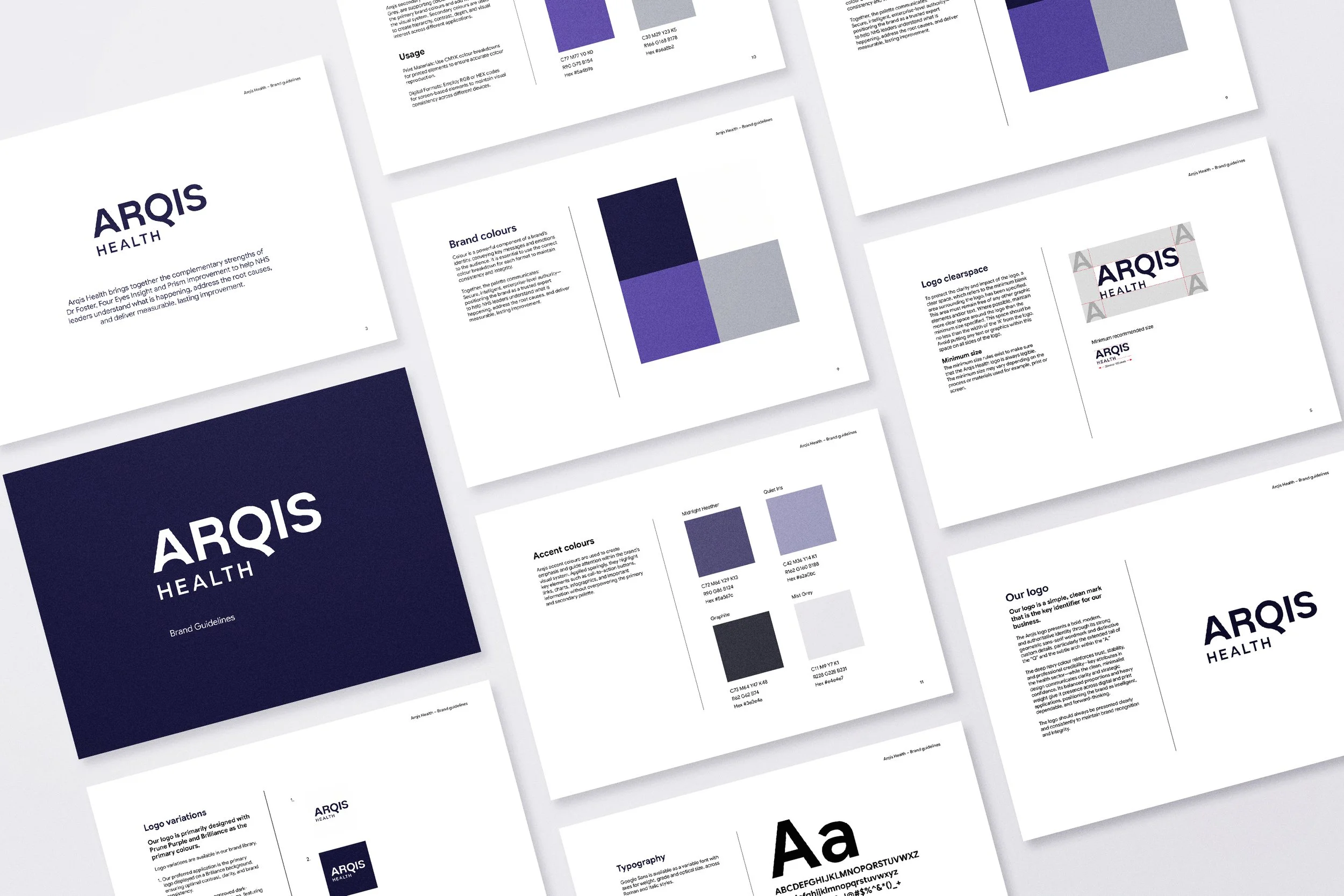
Detailed brand guidelines were developed to clearly articulate the organisation’s visual and verbal identity. This included direction on logo application, typography, colour systems, imagery approach, and core layout principles. The result was a practical toolkit designed to ensure clarity and consistency across all future communications.
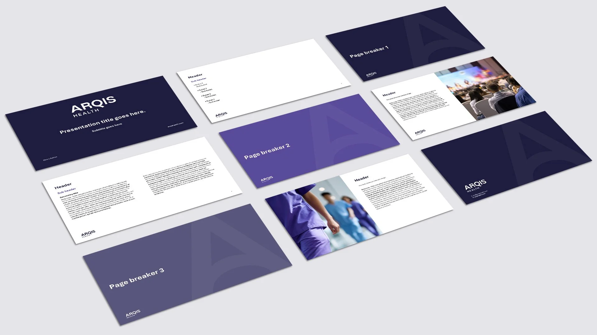
A custom PowerPoint template was produced to help the team create professional, on-brand presentations with ease and confidence.
Extending the new logo into the digital environment, Paul designed and built a new website. Designed with usability, accessibility, and long-term scalability at its core, the website strengthens the brand presence online while providing a flexible foundation for ongoing growth and content development.

Testimonial:
When we began collaborating with Helen on the Arqis Health brand, it was at the outset of the company’s journey. We discussed our ideas regarding brand style and colour palette with Helen, and once again, she exceeded our expectations. She fully grasped our brief and enhanced our vision. Thank you, Helen!
— Elizabeth Duffy, Marketing Manager, Arqis Health (Dr Foster, Four Eyes Insight & Prism Improvement)
Client:
Arqis Health brings together the complementary strengths of Dr Foster, Four Eyes Insight and Prism Improvement to help NHS leaders understand what is happening, address the root causes, and deliver measurable, lasting improvement.
To find out more visit: https://www.arqishealth.com/