

Dr Foster
– Logo refinement
– Brand identity
– Brand guidelines
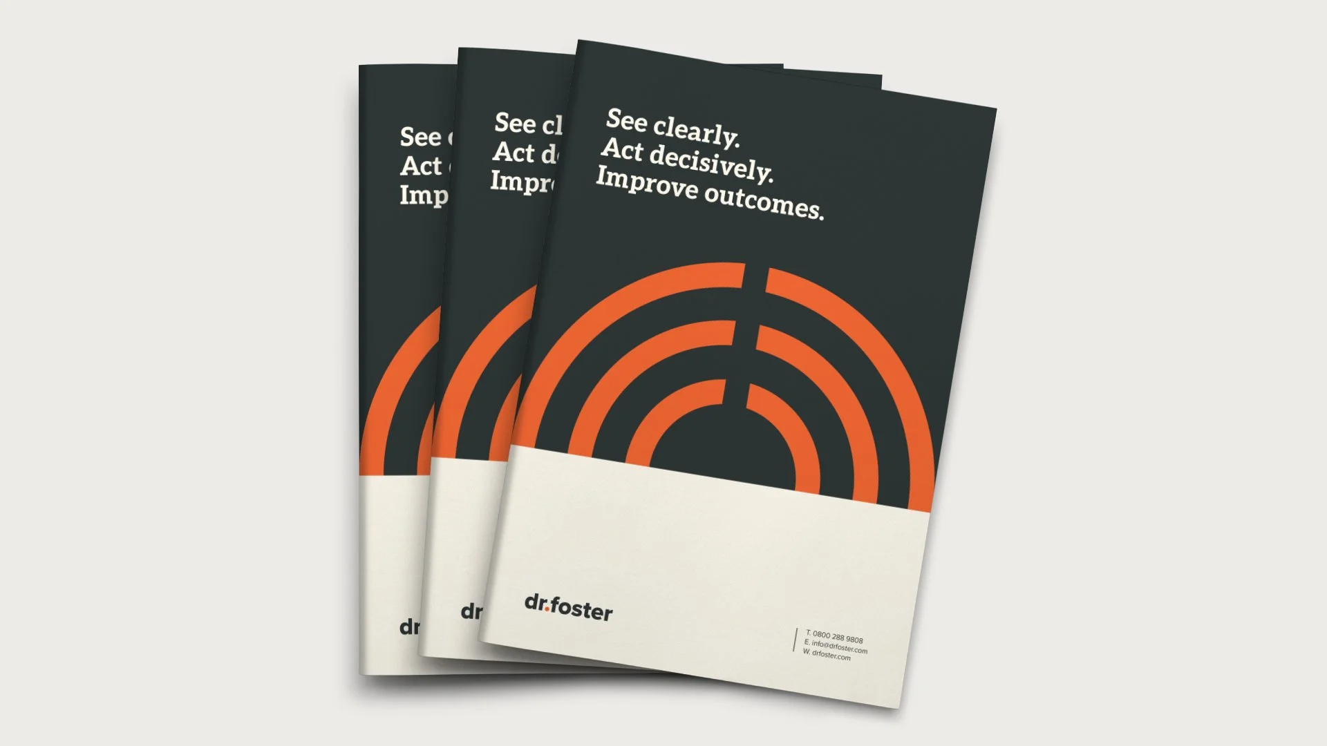
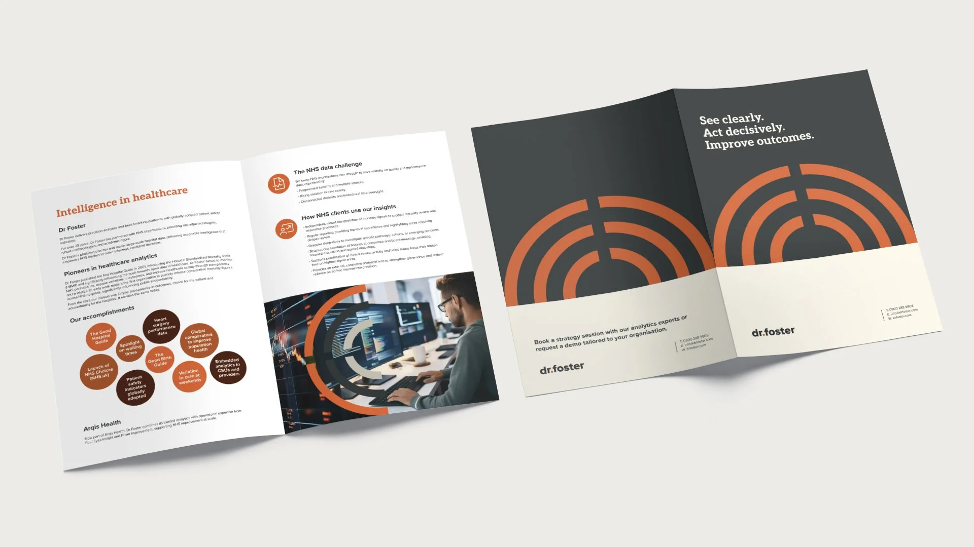
– Brochure
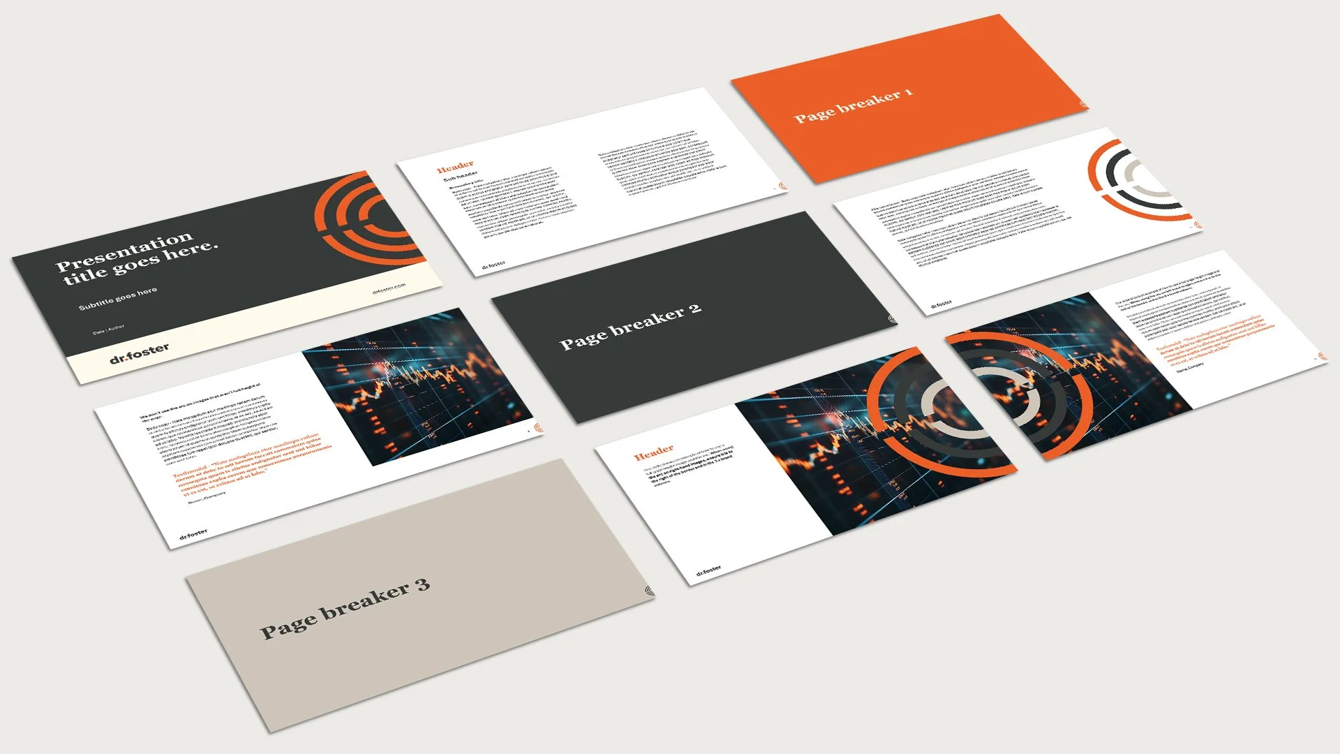
- PPT template
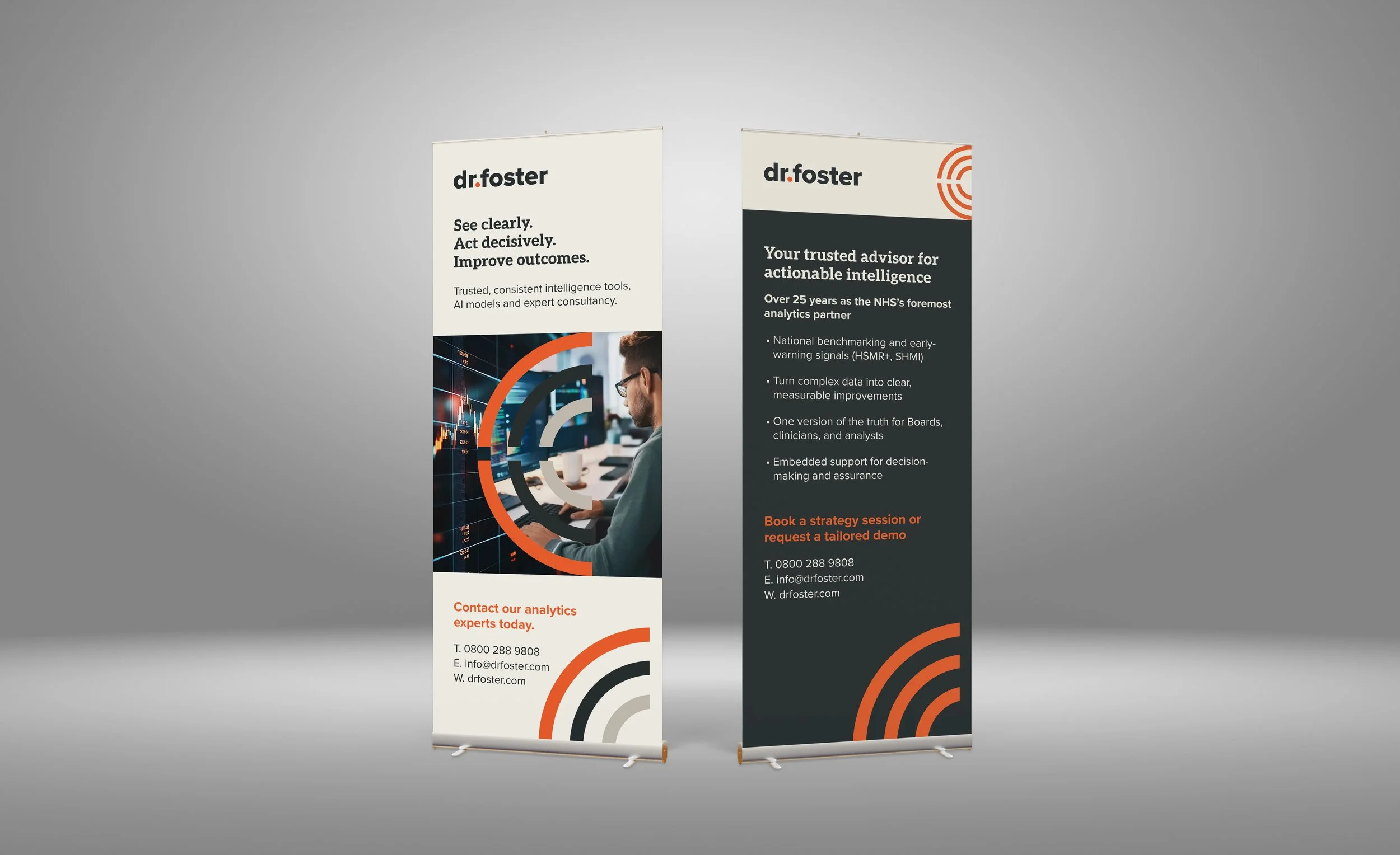
- Roller banners
Overview:
Collaborating with Paul Waddington of DDME, I led the evolution of the Dr Foster brand — refining the logo and building a distinctive visual identity. The new direction was rolled out across comprehensive brand guidelines, a brochure, PowerPoint template, and impactful roller banners, while Paul designed and developed the website to bring the identity to life digitally.
Working closely with the core team at Dr Foster, the project began with a comprehensive brief outlining the company’s background, the evolution of its previous logos, and its current value proposition. This ensured the redesign remained grounded in brand heritage while moving toward a more contemporary and flexible identity.
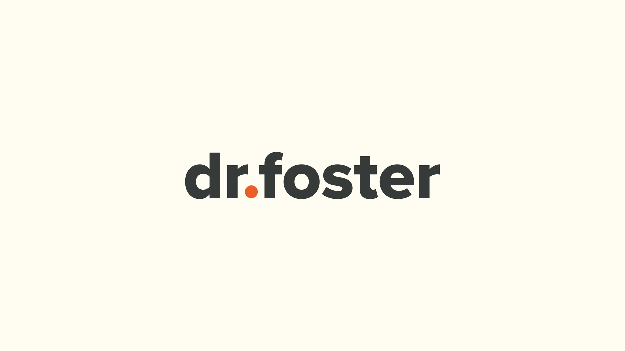
The solution centred on a refined lowercase wordmark, preserving the brand’s approachable, human tone.
A new typeface was selected and carefully adjusted through subtle optical refinements to improve balance, weight, and legibility across a range of applications.
An orange dot was introduced as a visual anchor and distinctive brand device. Acting both as a punctuation mark and a symbolic focal point, it adds warmth and memorability without compromising clarity or scalability. This considered detail is the guiding principle of the mark: simplicity with a point of distinction.
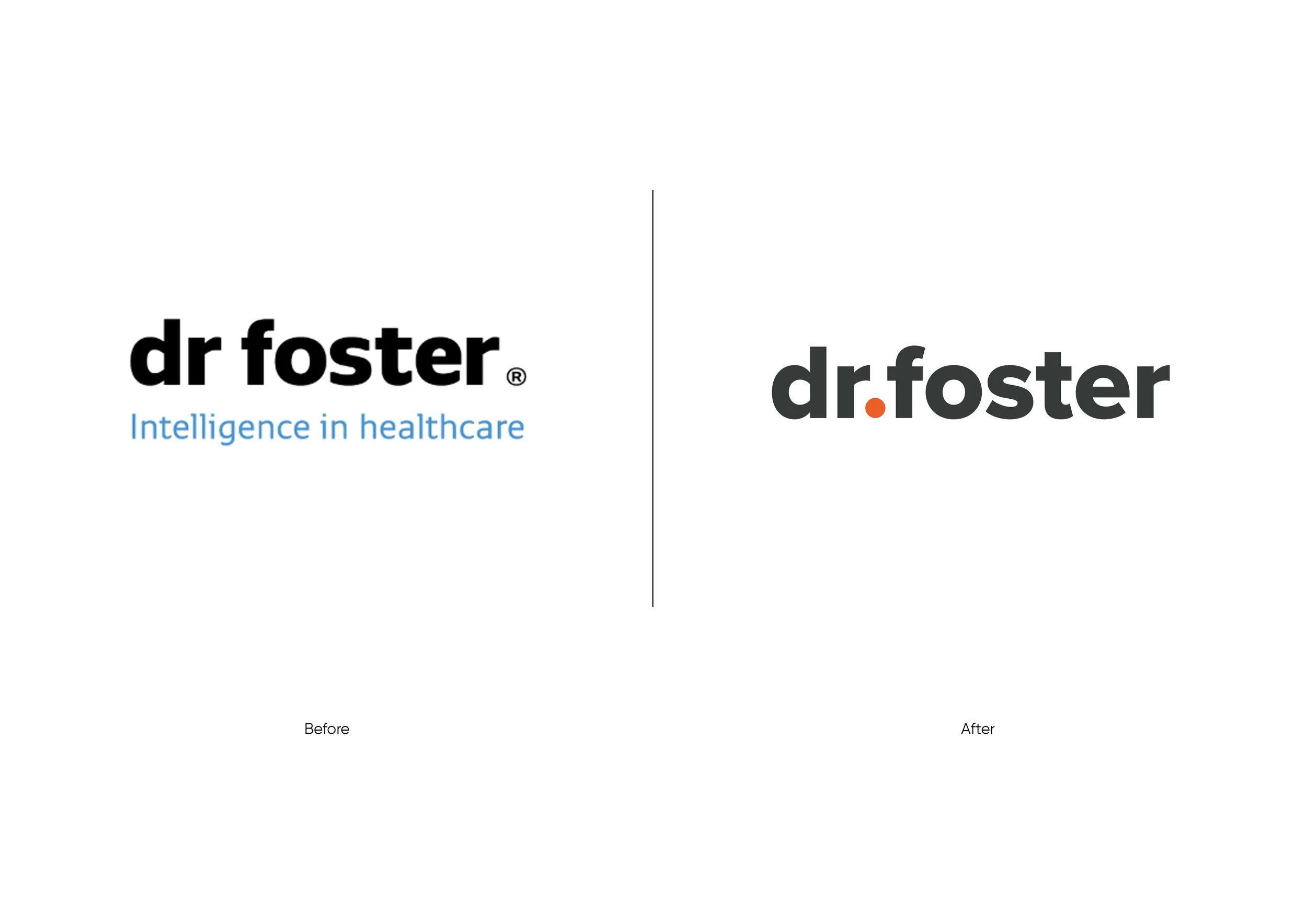
A core shape from an earlier mark was reinterpreted and refined, allowing the new identity to carry forward recognisable brand equity in a more modern and flexible form.
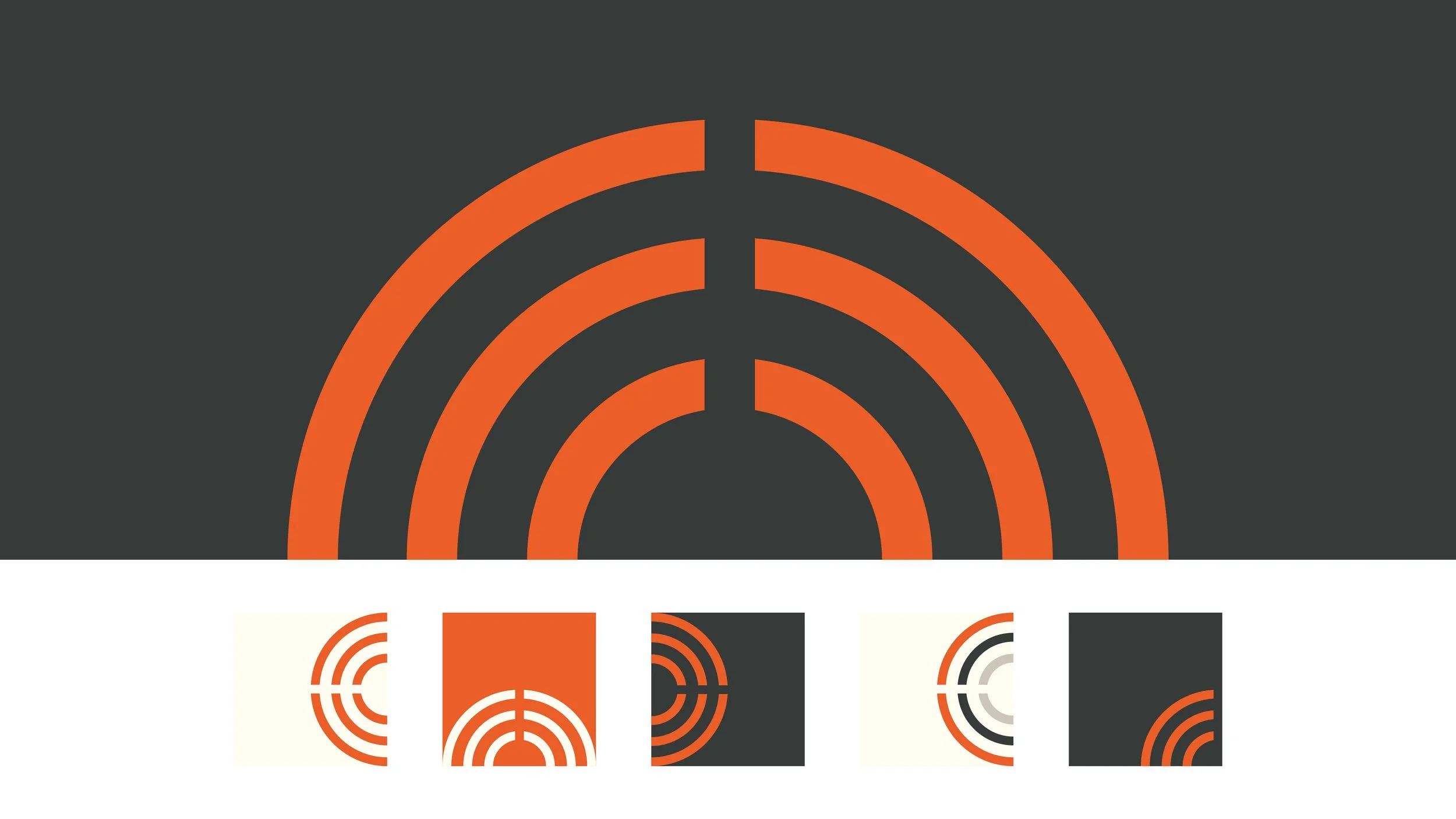
The Arc is an abstract expression of data in motion—insight radiating outward to embody communication, transparency, and the accessible flow of information. Its expanding form reflects both the dissemination of knowledge and the strength of our monitoring and analytical capability.
At a patient level, the outward movement signifies positive impact growing from a central source of care. It represents how insight travels across systems, services, and communities—connecting people, informing decisions, and elevating standards. The form conveys influence, connectivity, and the power to drive measurable improvements in outcomes.
For Dr Foster, with its focus on healthcare data, performance reporting, and system-wide intelligence, the Arc is a fitting and powerful mark—visually capturing their role in turning complex data into clarity, accountability, and meaningful change.
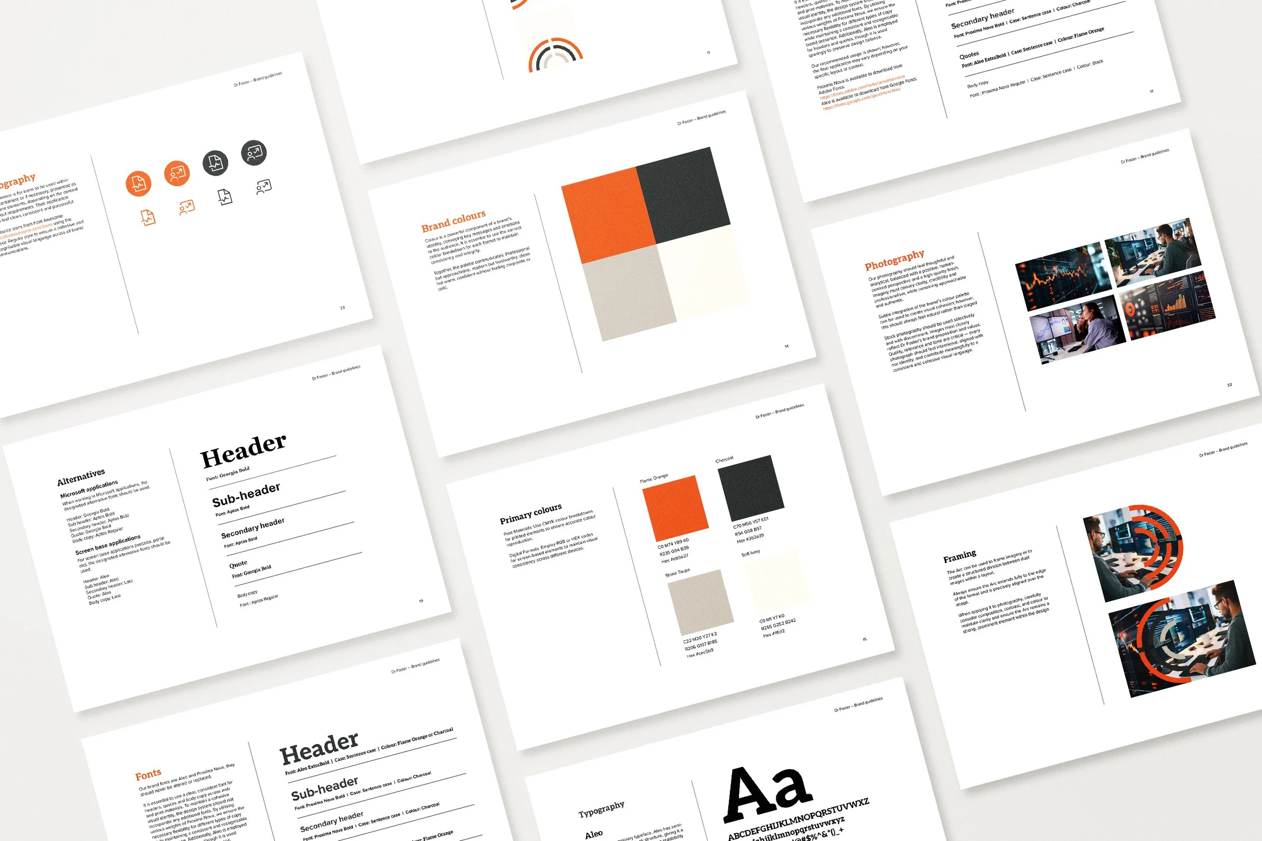
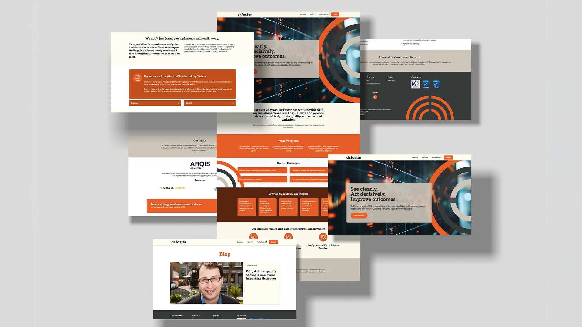
The new direction was carefully developed and implemented across a full suite of brand touchpoints to ensure clarity, consistency, and long-term impact. Comprehensive brand guidelines were created to define the visual and verbal identity in detail, covering logo usage, typography, colour palettes, imagery style, the arc element usage, and layout principles. These guidelines provided the organisation with a practical framework to maintain cohesion across all future communications.
To support business development and stakeholder engagement, a professionally designed brochure was produced that articulated the organisation’s vision, services, and key differentiators in a clear and compelling format.
A bespoke PowerPoint template was also created, enabling the team to deliver polished, on-brand presentations with confidence and consistency. For events and in-person engagement, a series of bold, impactful roller banners were designed to capture attention and communicate core messaging at a glance.
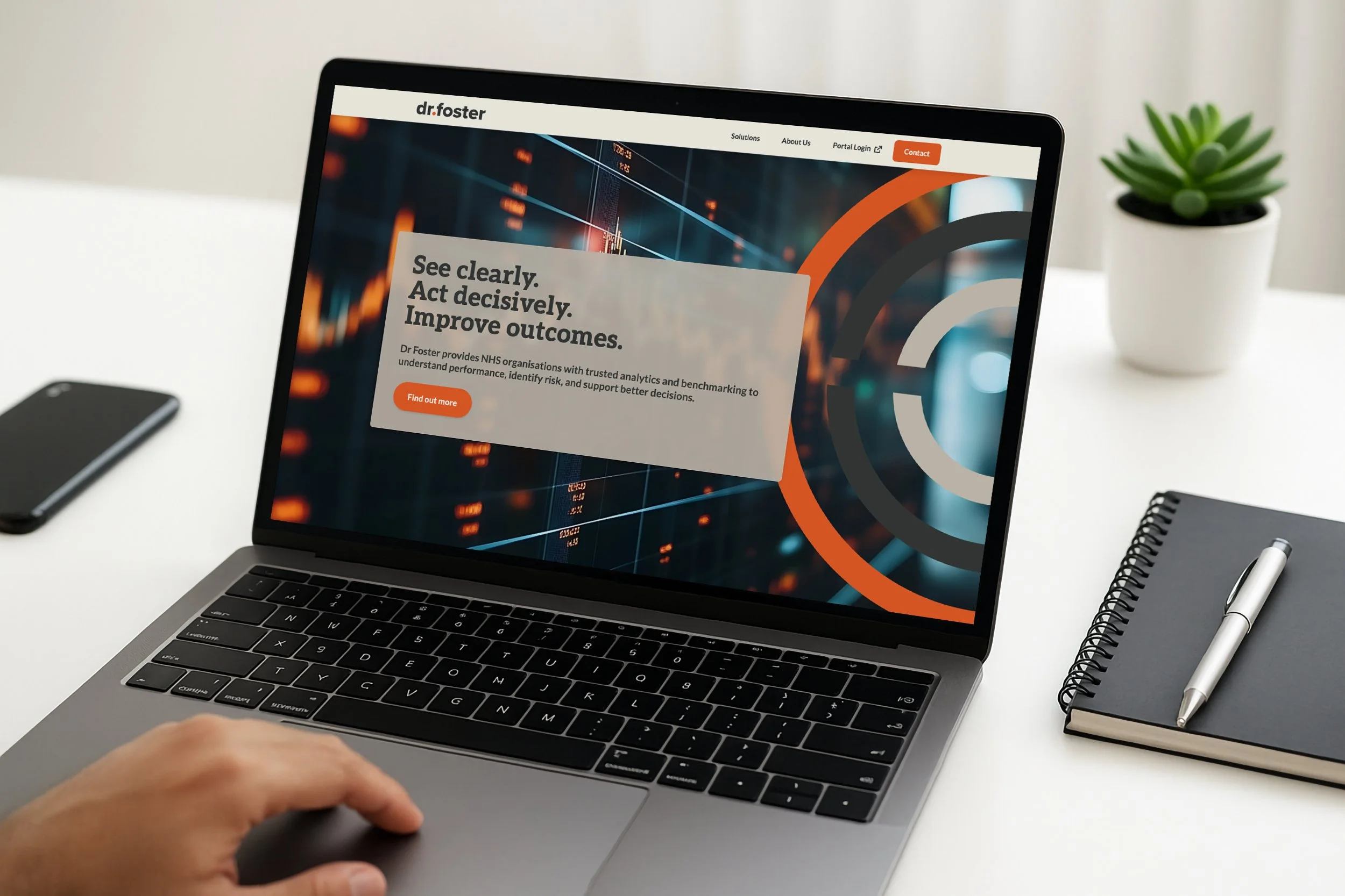
To bring the refreshed identity to life in the digital space, Paul led the design and development of a new website. The site outlines key solutions including performance analytics, benchmarking, population health management, and expert consultancy. Built with performance, accessibility, and scalability in mind, the website not only reinforced the new brand direction but also created a dynamic platform to support future growth, content updates, and audience engagement.

Testimonial:
Working with Helen on the Dr Foster branding was really enjoyable. Helen took the time to truly understand our vision and transformed it into a brand that feels authentic, with a nod to the previous brand from 25 years ago.
When she presented her work to us, we were all incredibly impressed and loved what was produced – every detail was considered and told its own story. I look forward to working with Helen again in the future and would recommend her work to anyone.
— Elizabeth Duffy, Marketing Manager, Arqis Health (Dr Foster, Four Eyes Insight & Prism Improvement)
Client:
See clearly. Act decisively. Improve outcomes.
Dr Foster provides NHS organisations with trusted analytics and benchmarking to understand performance, identify risk, and support better decisions.
To find out more visit: https://www.drfoster.com/