
Tilecrafter
– Logo
– Brand identity
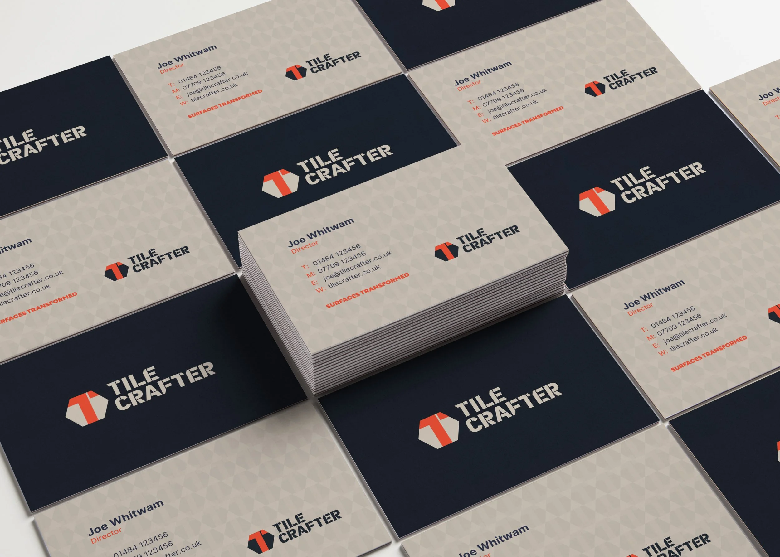
– Brand guidelines
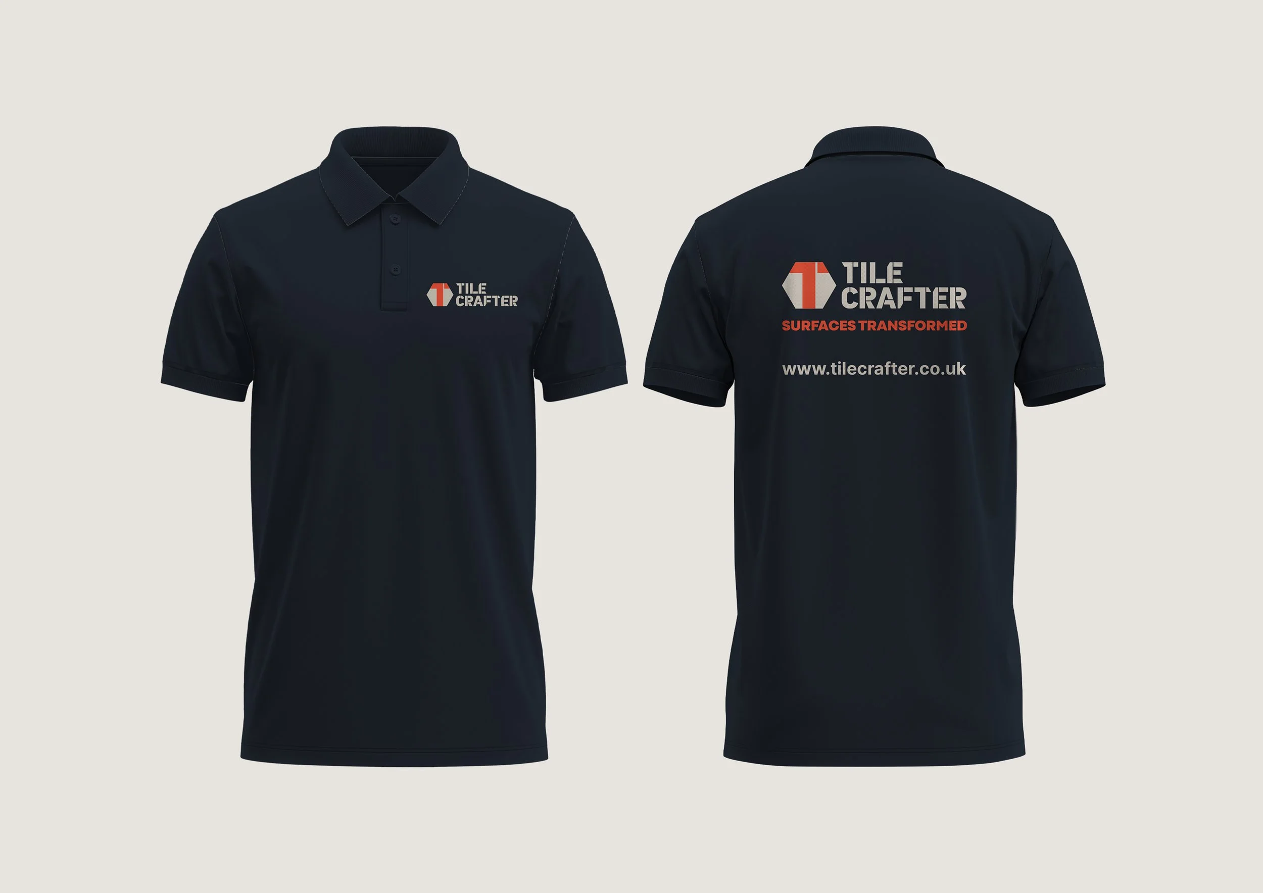
– Apparel
Overview:
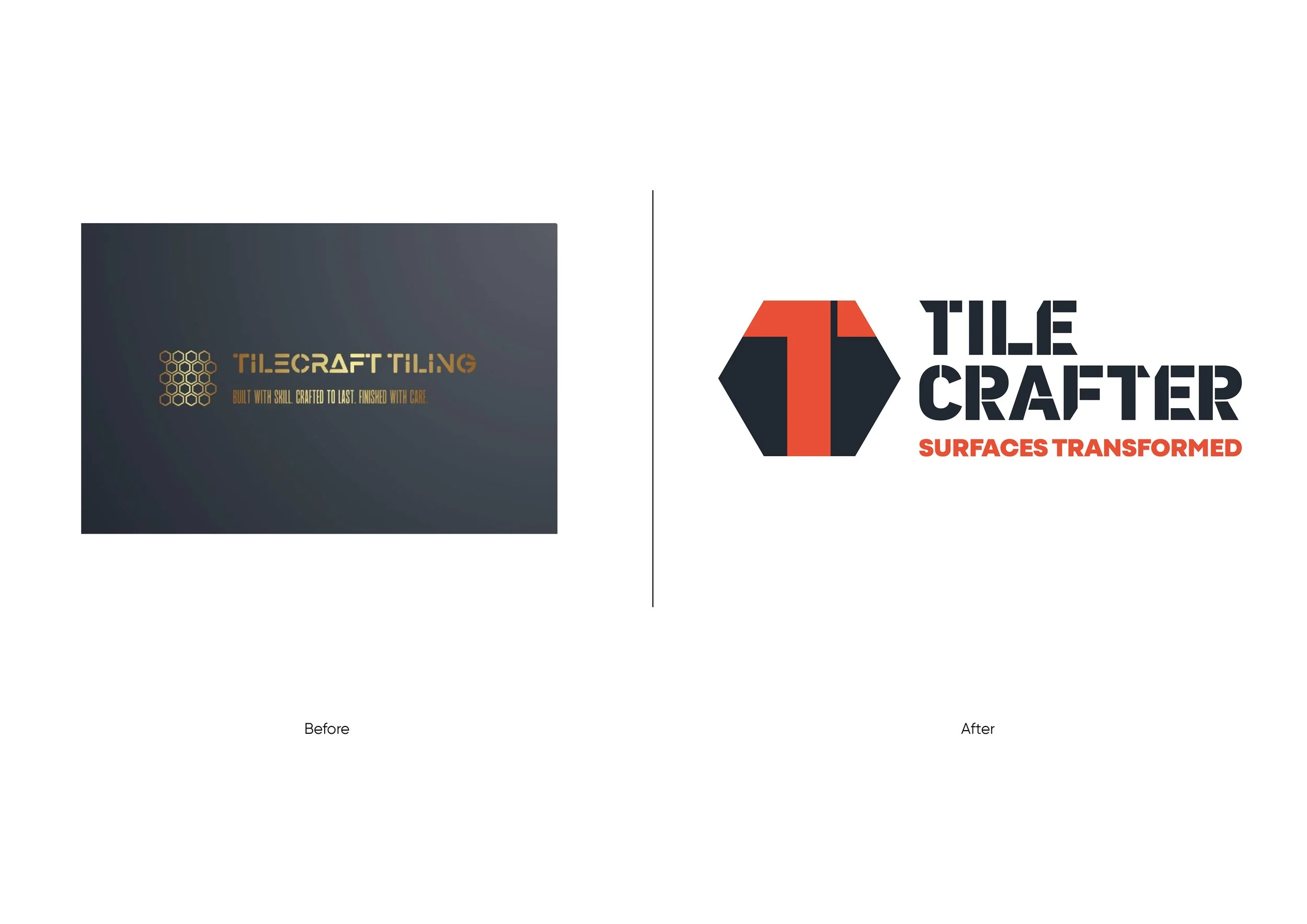
Joe approached me in the early stages of building his business with an initial logo concept and a clear vision of the style he was drawn to. The honeycomb tile shape and stencil-style typography suggested craftsmanship and structure, providing a strong starting point, but the identity needed refinement to better represent the quality and precision of his work.
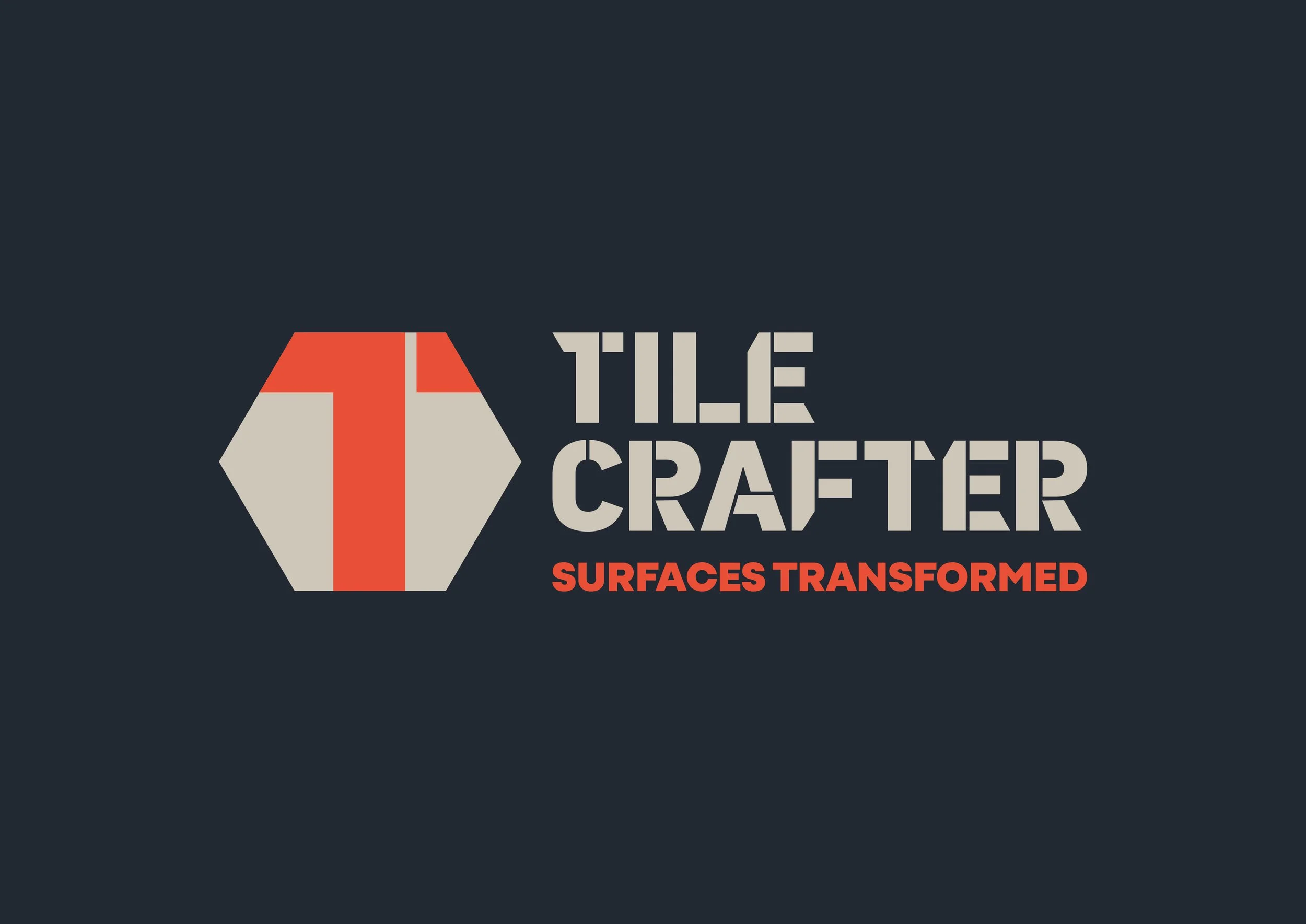
Typography became a key focus of the brand development. The bold, stencil-inspired Tilecrafter logotype was refined to feel purposeful and robust, with sharp cuts and solid forms that reference the tools, materials, and accuracy inherent in tiling. The engineered nature of the letterforms reinforces durability and skilled workmanship, rather than decoration for its own sake.
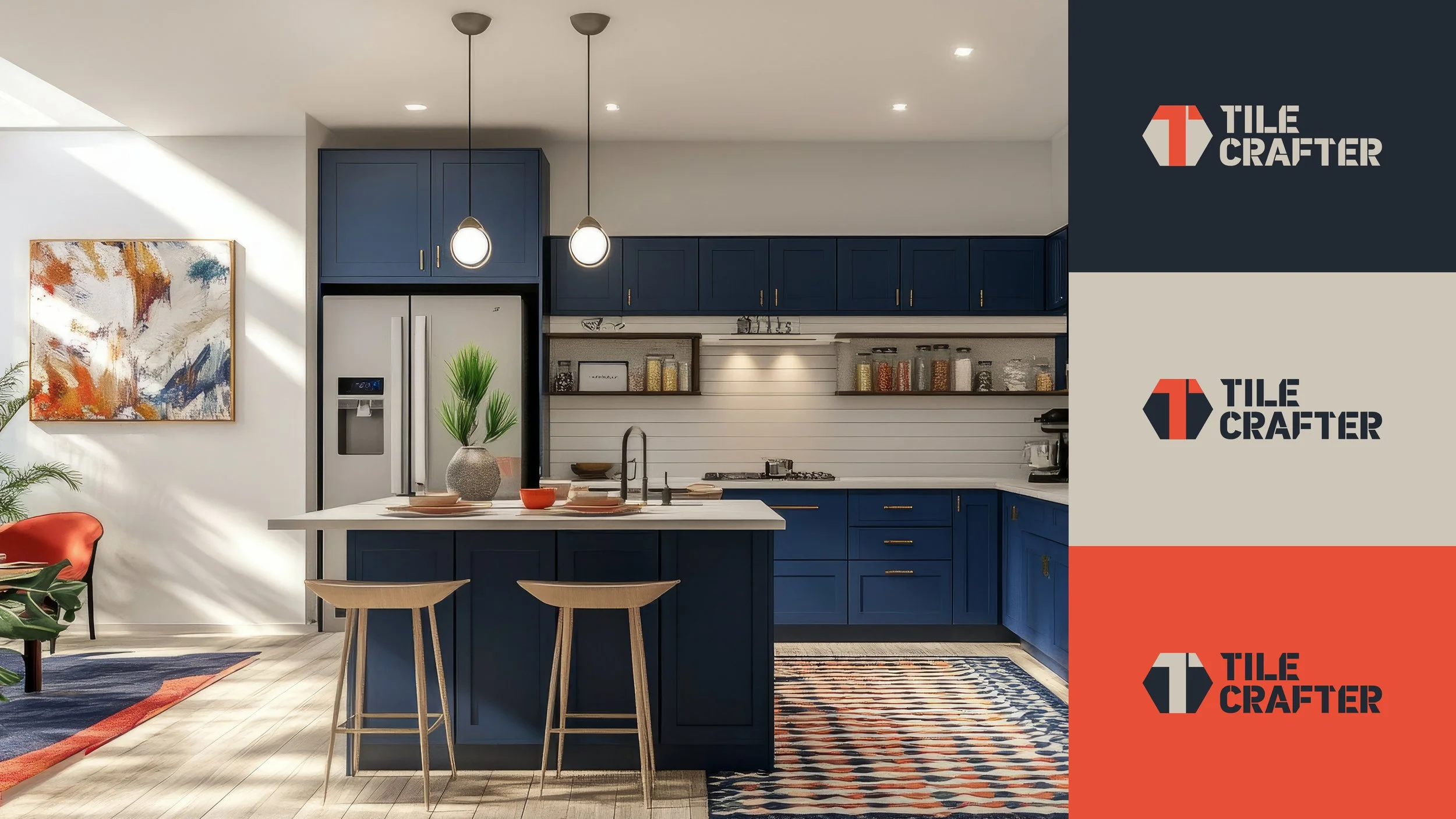
The hexagonal symbol was developed in parallel with the type, creating a strong central “T” that seamlessly connects the icon and logotype. A revised colour palette and carefully considered strapline completed the system, transforming the original idea into a cohesive and versatile brand identity.
The final result is a clean, confident, and professional identity that feels established and built to last — positioning Tilecrafter as a modern, credible brand ready to stand out in a competitive market
Client:
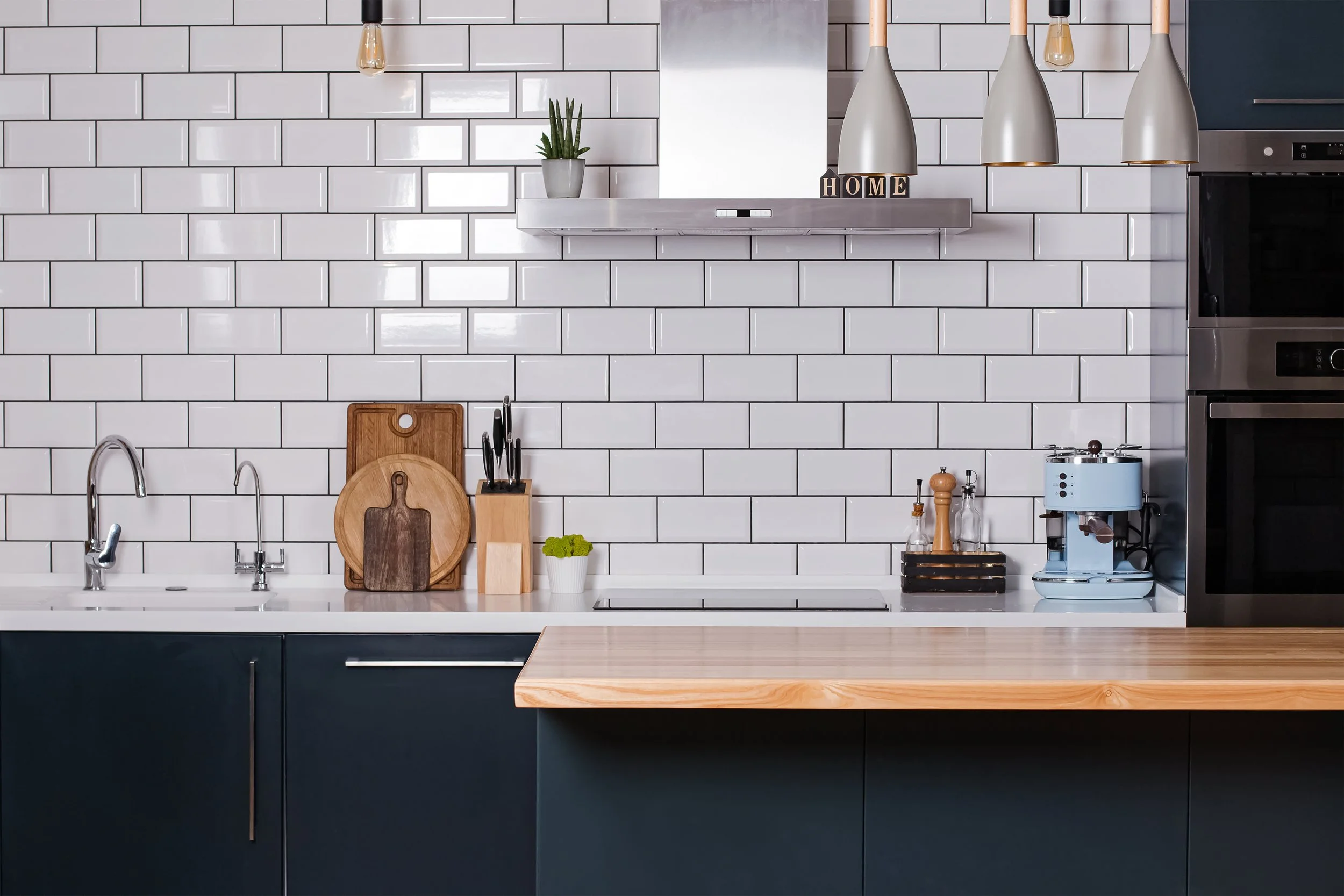
At Tilecrafter, we pride ourselves on delivering bespoke tiling services tailored to your unique needs. Specialising in kitchens, bathrooms, and beyond, we offer expert craftsmanship in both small floor tiling and intricate wall designs. Whether you’re looking to refresh a single room or transform your entire space, we are committed to providing reliable, high-quality tiling solutions that stand the test of time.
From start to finish, Tilecrafter brings precision, professionalism, and a personal touch to every project across Huddersfield and West Yorkshire.