
Maisora
– Logo refinement
– Brand library
- Context mockups
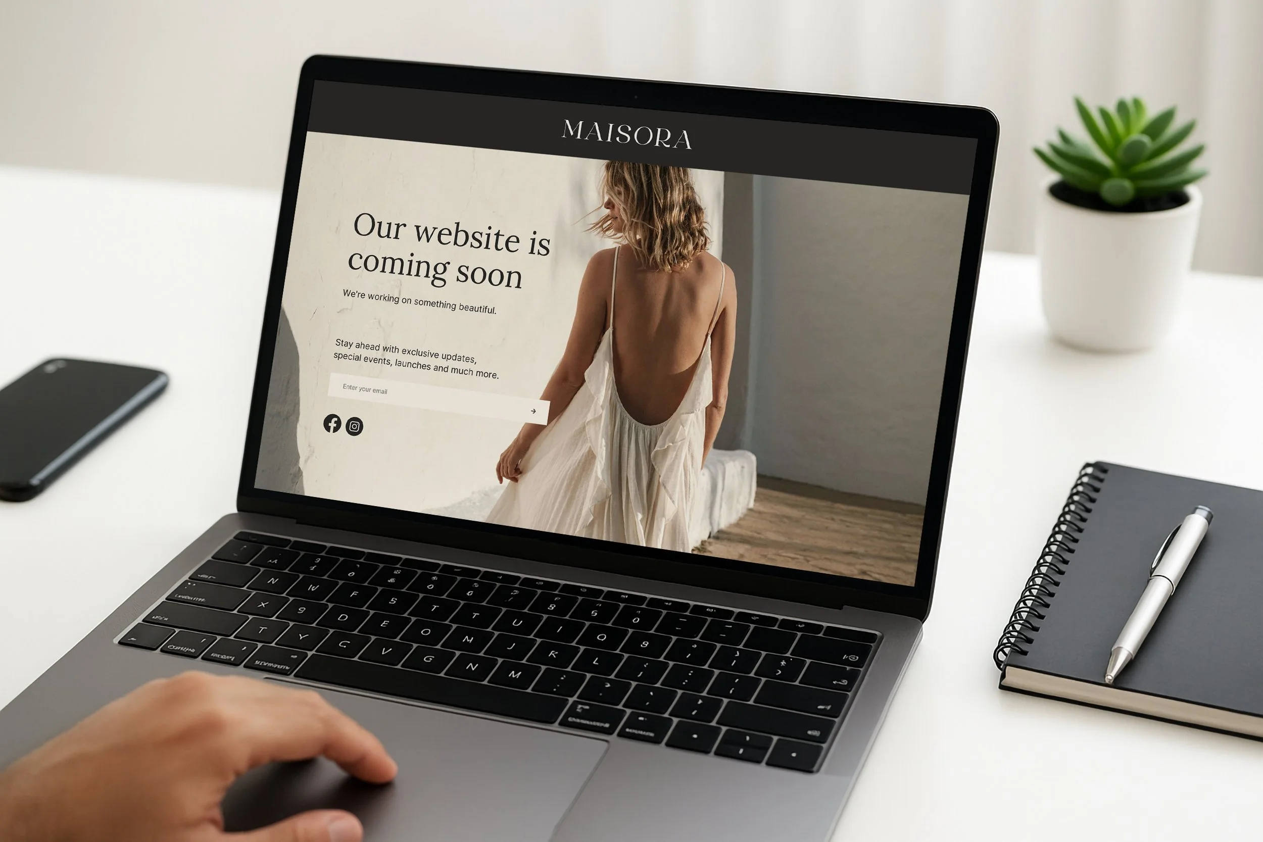
- Website concept
- Literature
Overview:
I met Elizabeth at a networking event, at the bar, of all places! What started as a casual conversation quickly turned into a discussion about the company that was launching and the vision for its brand. After sharing a detailed brief outlining the company, brand concept, deliverables, and style direction, I was asked to help bring the logo to life. Using that guidance, I developed a logo that captured the vision and aligned perfectly with building the brand.
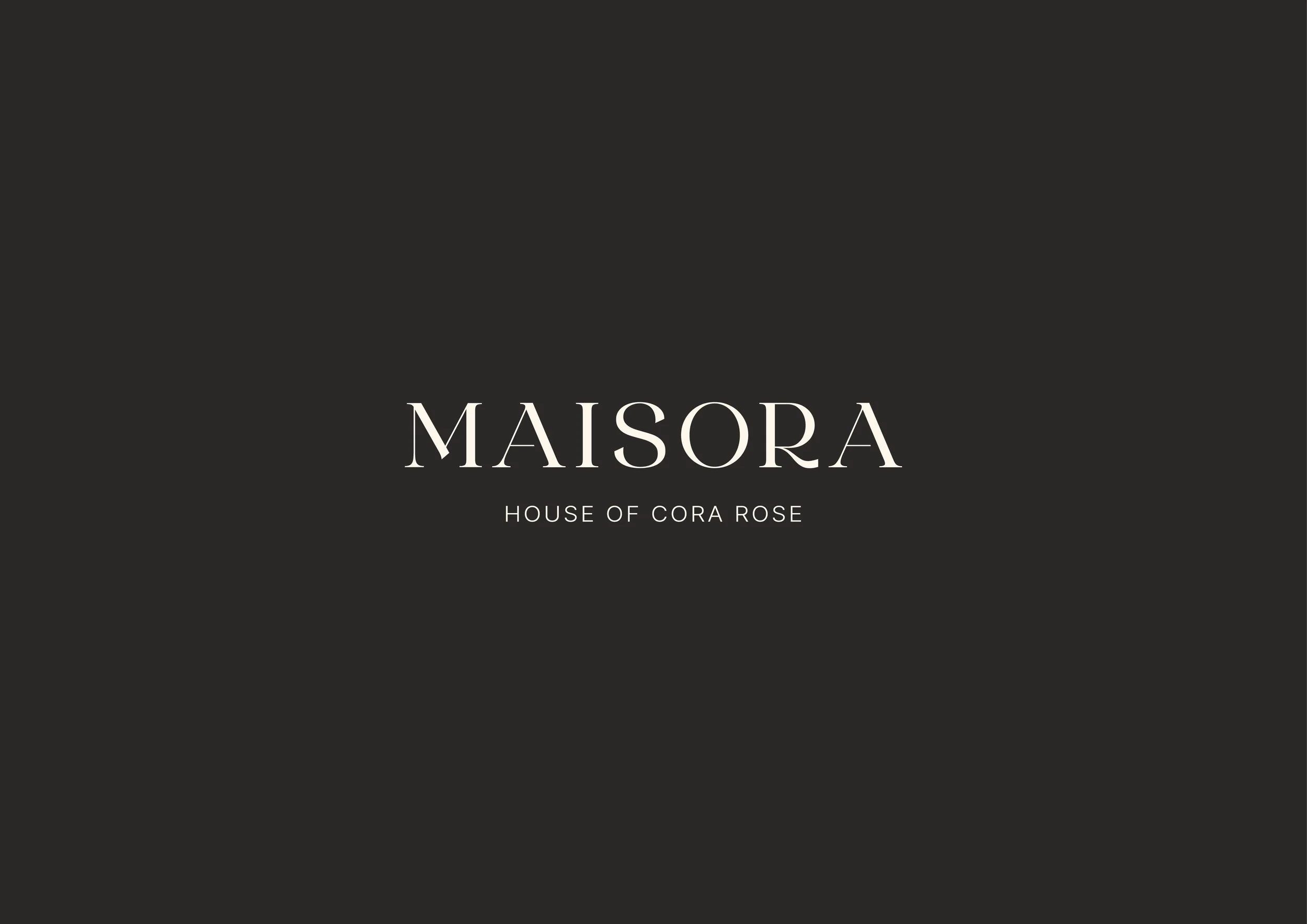
After reviewing an earlier visual of the logo development, I created and presented a creative concept that outlined my design process, along with the proposed colour palette, typography, and supporting visual direction.
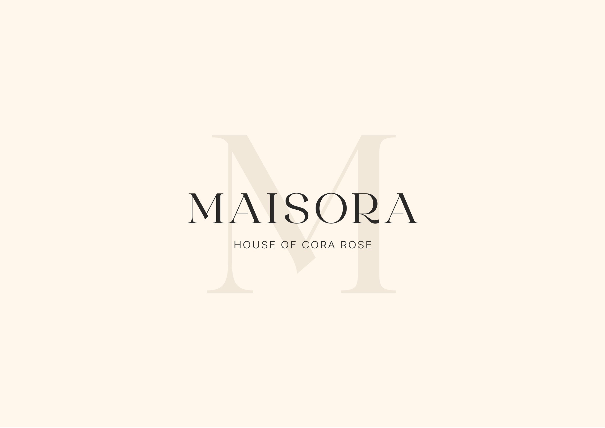
A distinctive feature of the logo is the subtle curvature within the centre of the “M”. This bespoke detail softens the otherwise structured serif typography, introducing a sense of individuality while maintaining the mark’s overall elegance and balance.
Beneath the primary wordmark, the tagline “House of Cora Rose” is set in a clean, widely spaced sans-serif typeface, creating a deliberate typographic contrast. This pairing strengthens the visual hierarchy: the brand name commands attention, while the tagline subtly reinforces the brand’s narrative. The generous letter spacing also echoes the spacing within the main wordmark, visually connecting both elements.

The final Maisora logo establishes a refined and sophisticated visual identity centred on elegant typography and minimalist design principles. The wordmark features a high-contrast serif typeface, conveying a sense of luxury, heritage, and timelessness, while subtle custom refinements elevate the mark beyond a standard typographic logo. Overall, the identity communicates a brand that is elegant, considered, and confident, with a restrained design approach that reinforces its distinctive and premium presence.
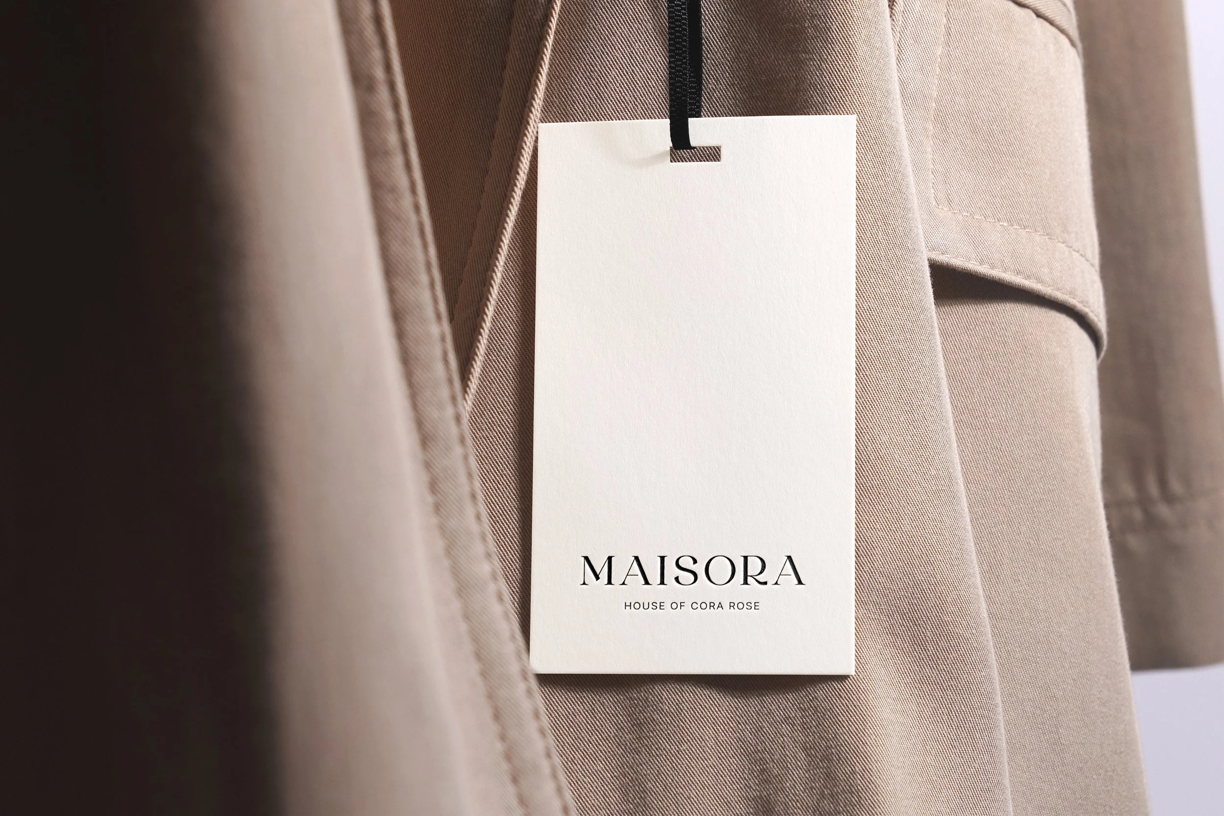
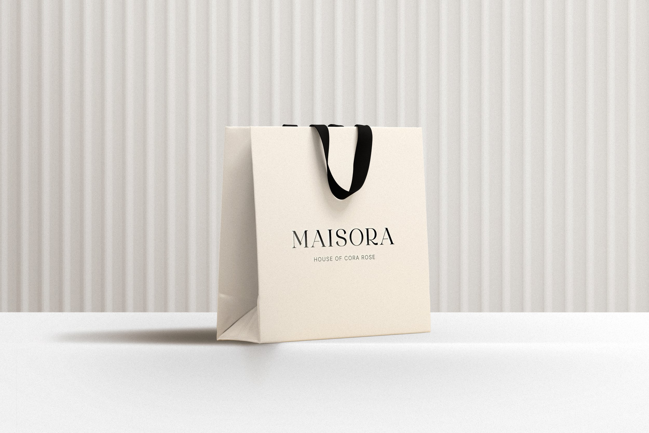
Building on this foundation, a cohesive brand library was developed to support consistent application across all brand touchpoints. This includes the defined colour palette, typography, logo variations, and supporting visual elements, providing a flexible system that can be used across deliverables such as print materials, packaging, website design, and social media, ensuring the Maisora identity remains recognisable and cohesive across both digital and physical platforms.
Testimonial:
“Absolutely love this! Helen has completely elevated the Maisora brand and positioned it exactly where I envisioned it — sophisticated, considered and effortlessly luxurious.
She understood the vision from the outset and translated it into a brand identity that feels incredibly refined and premium, while still capturing the personality and essence of Maisora. Every detail feels intentional, from the overall aesthetic through to the finer brand elements, and it has given me complete confidence in the direction of the business.
The finished brand feels so much more elevated than I could have imagined, and I’m incredibly proud of what we’ve created together. I’m now so excited to launch Maisora and bring the whole vision to life.”
— Elizabeth, Maisora
Client:
Maisora is a curated, editorial wardrobe – mixing pre-loved luxury, modern basics, and personal styling for women today and the generations to follow.
- Pre-loved luxury fashion
- Contemporary wardrobe staples
- Jewellery and accessories
- Natural skincare and lifestyle pieces